Friday, July 30, 2010

Unfinshed Wood Box

As promised, today I’m going to show you how I made my unfinished wood box that my birdie (from last weeks post) sits on.

I got this box from my most favorite store in the world…Dollar Tree. Ok, that might be an exaggeration…but I do heart me some Dollar Tree! :)

So, this is what I started with:


I didn’t take picture of the next few steps.

I didn’t sand it. I didn’t paint it. I simply cut scrapbook paper down to the size of each side/section. It’s fine if it’s not perfect! I never do anything to perfection….TRUST ME! ;-) You’ll be sanding and aging it, so you’ve got room for error.

Next, I used my favorite craft item on the planet…Modge Podge! Cue the harps!!

If you have not discovered Modge Podge yet…you’ve never crafted! ;)

If the cats sit still long enough, I might even Modge Podge them to my next project! Here kitty, kitty! LOL

Modge Podge is as simple as, get one of those foamy brushes that look like this:

And slather the gluey paste all over your box. Don’t use too much!! It just makes a huge mess and dry time takes for.ev.er. and you’ll end up with more puckers in the paper and it won’t be flat when it dries. I’m guilty of this! Also, put a little on the backside of your scrapbook paper, then adhere the paper to the box. Use a flat edge, like the edge of a credit card, to run across the paper, this will push out any air bubbles.

Now you have to let it dry. I HATE WAITING! But it’s a necessary step.

Now, don’t freak out at this point. If you pushed your paper down with a flat edge really well, and you don’t have globs of the glue, you might see some air pockets under the paper. They will actually work themselves out and it will dry flat. It’s really kind of amazing.

Now your box will look like this:


Well, it won’t actually look like THIS unless you use the same paper (which I got from Archiver’s – they have the best paper and you get coupons emailed to you weekly if you sign up)…but you get my drift! :)

Now, when it’s dry, you want to sand the edges. I use a sanding block…outside (unless you like to dust). This will knock down any rough edges, make the paper more worn looking, and more like it is part of the box, not something that’s glued on. And actually I just realized the picture of above is after THIS step…oops. Here’s another showing you the back. I used an Xacto knife to cut around the hinges. Again, perfection is overrated!


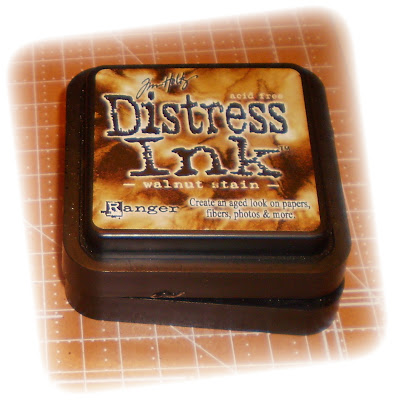
Next, wipe all the dust off. Now you are going to distress it even more. I told you about this product last week, Jim Holtz Distressing Ink.


Walnut Stain and Tea Stain are the two that I have that I use on everything.

This stuff takes some practice. So, if you are new to it, I’d practice on scrap paper.

I run the stamp pad along the edges and then use a paper towel (or my fingers) to kind of buff it out some so it smears a little. But if it’s still too wet it can smear out of control and it dries super fast, so I work in little sections at a time. You can always add more….you can’t take away! Just go back over spots until you get a look you like. With the Walnut, I concentrate on the edges…every single edge. Then I use the tea stain after and kind of bring it out from the edges a bit more because its’ not as dark (for this part I usually use a paper towel, run it along the stamp, then smear it onto the box.)

You’ll have something like this:

At this point, you will want to do another coat of Modge Podge over the entire box. This will seal everything.

The box is pretty enough at this point, so you could stop. But why? ;)

I decided it needed some embellishment. So I headed to Michaels (because I had a coupon for 40%) and bought the Jim Holtz – Idealogy Key Hole embellishments. They run around $7 for 5, but again, I had a 40% off coupon! So, let’s say $4 divided by 5 embellishments = .80 cents per key hole. Not bad.

A little craft glue, and voila!!! The finished box!

Let’s do the breakdown:
$1 for the box
$1 for the paper
$ .80 for the keyhole
I already had the Modge Podge
I already had the distressing inks

So, for less than $3 I have this adorable box from the Dollar tree!! :)

And let’s not forget my little birdie from last weeks “No Function Friday” (which yes, I have officially decided on) sitting on top of my box, which only cost me $1!

I'm going to link up to some parties, like:


Simpsonized Crafts


The Girl Creative


The DIY Show Off


UndertheTableandDreaming


Come by next week and figure out the purpose and function for your living spaces!

Until next time…

Tuesday, July 27, 2010

Defining Your Purpose

What is the purpose for each room or space in your home? Do you take a step back and define the purpose of you room before you decorate or furnish it? Do you have a room that just isn’t functioning the way you wish?

Once you’ve created the purpose for a room, only then can you make sure it functions for the intended use (purpose) of the room.

Dictionary.com defines purpose as:
1. the reason for which something exists or is done, made, used, etc
2. an intended or desired result, end, aim, goal
3. determination; resoluteness
4. the subject in hand; the point at issue.
5. practical result, effect, or advantage: to act to good purpose.

Knowing your room’s purpose will help direct your decorating choices.

In case you haven’t seen it yet, there is a relatively new website called Catalog Living, which is the creation of Molly Erdman, a Los Angeles-based actor, writer, and comedian. It’s what she describes as “a look into the exciting lives of the people who live in your catalogs.” It is hilarious as she describes her fictional characters living in perfectly ‘staged’ rooms with items that would make NO sense in a home someone actually lives in.

But often these are the homes we are drooling over and trying to emulate…and yet when you break them down, they are not realistic for most people/families. Basically, Catalog Living is EXACTLY what I’m describing! Beautiful, yet totally non-functional, rooms!

It’s one thing to have a beautiful, picture perfect room. But if it doesn’t have a purpose and doesn’t function for the way your family lives, then it’s simply put…wasted space.

Here’s an example of a GORGEOUS dining room from Restoration Hardware! I look at this and think of how stunning each piece is and I even fantasize about having dinner there…for about a minute.


Until I realize:

  1. I don’t have dinner guests! Or at least not more than the four that can fit at our current table.
  2. We are not ‘formal’ people! We’d seem out of place in our own house at that kind “get-up” (that’s my southern twang coming out fer ya!). 
  3. I have a child….with friends….I would NOT want to clean those chairs after my family eats there!
  4. I have cats…who shed….a lot. I’d have to de-fur those chairs just to eat there.
  5. I’d have to clean that room…dust, mop, decorate it, buy dishes for it, table linens, lots of topiaries to put on the table, I’d have to water those I suppose, and those beautiful pedestal style legs would require a lot of dusting every time I cleaned for the amount of cat hair that would sit on them. Hmmm….I could probably knit a cat from all that hair! ;) 
For me, this room would be useless and would require a whole lot of my time to take care of it, and for what? So, I might use it once a year. No thanks….I’ll be reading a book instead. :)

BUT…for a couple who entertain a lot, a large family, or just more ‘formal’ people than us…this room might be perfect! That’s why it’s important to decide what each of YOUR rooms purposes are. (“Purposes” looks strange! But I didn’t get a squiggly red line underneath it, so I’m guessing it’s a real word. LOL)

For me, it would be unused, therefore serving no (here it is again) purpose in our house. And that’s my favorite part of my home or any small home…every inch must be used! Every square inch of a small home is a rich commodity.

In my last home I had a formal living room. It truly served no purpose. We didn’t use it. Anything I put it there, was just there to fill space.


 (If you squint your eyes....this picture won't look bad! LOL)


We didn’t need another room to sit in…the family room was perfect!
 
Its purpose was well defined…it’s where we ‘lived.’ My daughter could play in there, we watched movies in there, I read books in there, took naps in there, had sleepovers on the couch and floors in there, and visited with friends and neighbors in there. Did I mention it was perfect? :)
 
And oh how I miss that fireplace!!!  But I digress…
 
The unused room drove me nuts! I just didn’t see a purpose for it. I couldn’t even dream up a purpose for it. Everything we did in our family already had a room designated to its purpose. So, it sat. Mostly unfurnished except for a few ‘show’ pieces like the bookshelf that I only bought so I had something in that room. 
 
So, I heated and cooled, decorated and dusted an unused room with absolutely no purpose to me!
 
My solution to my unused room dilemma? I moved. :)
 
Do you have a room that you use for your own purpose, and not the builders intended purpose? Do you have a troubled room in your home that has no purpose? Do you have a plan to create a purpose for it? Are you frustrated with any unused rooms? Please do tell!
 
Until next time...
We had a cozy family room, attached to the kitchen.

Blog Layout

Just a quick note, I wanted to let everyone know that, yes, I am aware that my blog's page layout is wonky at the moment.  I'm working on it.  So, please, please, please hang in there with me! :)

I think I'm at the point of sucking it up and (GASP!) hiring someone! 

But in the mean time, I will have a new post coming later today!  So, besides trying read what's behind dark line number one, that always appears in the first sentence, it should be a good and educational post!! :)

Until next time....

Friday, July 23, 2010

Bye Bye Birdie

Ok, so there is absolutely, positively…no function to this post. Only pure cheap frugal beauty!!

As a matter of fact, I’m tossing around the idea of having “No Function Friday’s”.

Like many of you, I’m a crafter. Some of my crafting does, in fact, involve things that function. But most don’t.

I’ve been hanging out at the Dollar Tree A LOT some lately. There is nothing I love more than to take something inexpensive and turn it into something that looks like a million bucks…or four or five bucks works for me too. :)

Also, if it bombs…I’m not out much money. LOL

So my latest project involves the ceramic birds they have at the Dollar Tree.  I’m sure you’ve seen the birds. With their pinkish tinge and glued on sand.


First thing I did was sand my birdie to get as much of the sand off as possible, but leaving some is fine too…I want my birdie to look aged. Then I spray painted him white. Just plain old, cheapest I could find, white.


Then I started aging my little bird with my favorite ‘make-something-new-look-old’ product…Ralph Lauren Smoke Glaze from the Home Depot!


I just used an old paint brush and put the glaze all over my little guy. I made sure I got into the detail good because I wanted that to stand out. After a second I wiped it off with a paper towel…but an old rag would probably work better. I’m lazy and grabbed what was close (because I never am fully prepared when I do crafts. LOL)

Then let it dry. You may have to repeat this step if you don’t get the aging effect you wanted. I think I did my little birdie twice.


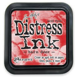
Then I also used Jim Holtz Distress Ink in Walnut and Tea stains (they have lots of colors to choose from…like red in the picture which I do NOT actually own) to make the details pop. This is actually for scrapbooking and paper crafts, but it works pretty good for crafts like these too. I’ve found the best way to apply this for a ‘natural’ effect is to use your finger. Warning – you will be stained for the rest of the day. ;)

I’m sure there is a much better product (like actual stain) that I will find one day when I’m not being too cheap thrifty to buy it. But I’ve just been using what I have on hand.

And here is my birdie in his after shot!


Not to shabby for a buck, huh? :)

I do plan to show you, very soon, how I made my Dollar Tree, unfinished wood box that my birdie is sitting on.

I'm linking to some parties for the FIRST TIME!!  I'm so excited!  So, hopefully I do this right.  I'm linking to the following parties:


Until next time...

Tuesday, July 20, 2010

Pretty as Pie

I have one single piece of furniture that I've had for years.  I don't think I could ever get rid of it.  It is the work horse of my home!

This piece of furniture holds photo albums, boxes and boxes of pictures, Doodle's art work for the first five years of her life, cards we've received for years, cookbooks, candles, user manuals for everything we own...even my U.S. Navy re-enlistment flag (which reminds me...I really should do something special - and more respectful - of that)!!  (Yes, I was enlisted in the Navy for 8 years.)  Basically every memory imagineable!  It used to hold gift bags, wrapping paper, ribbon, and tissue paper...as well as all that other stuff. 

It hides so much...um, dare I say it...clutter!

It's my pie safe.


At the risk of losing your admiration (ok, maybe loyal readership is more like it, LOL)...I'm going to show you the inside of my pie safe.


It even has a drawer for more junk important items! 


Do you see why I can't get rid of my pie safe?  Ever? 

It just holds so much, in one place.  And I don't have to look at any of it!!  Which is even better. :)

But it didn't always look like this. 

When I bought it, it looked like this....


When I started redecorating last year and moved the pie safe into the living room.  It just looked dated next to my new more updated asthetic. 

Its not an antique piece.  It's a Broyhill piece that my ex husband and I bought on clearance (because the back leg is dinged up...but really....who looks at the back leg) for $100, probably 10 years ago.

But I love the wood tone, so I knew I didn't want to paint it.

But I wanted to do something about the punched tin.  Punched tin isn't really my thing anymore. 

I considered putting frosted glass into it.  But that could get pricey...and broken. 

Also, I didn't really want to permanently alter the pie safe.  I mean, what if punched tin comes back!!  Stop laughing...you never know. ;)

Then one day I was in Bed, Bath and Beyond and saw bamboo-ish looking placemats for $2 each!!  I bought six of them, brought them home and cut them down to just slightly larger than each panel in the pie safe.  I glued the edges so they didn't come apart.  And I wedged them in front of the punched tin panels.

Unfortunately, I don't have pictures of this process because it was done about six months ago, before blogging was even a consideration.

But it instantly updated my adored pie safe!!!!


What about you.  Do you have a piece of furniture that acts as a work horse in your house?  Or something there is no way you could part with?

Until next time....

Sunday, July 18, 2010

Ready. Set. Action!!

The living room.  Or maybe you call it the family room.  In my house, it's just one room.  There aren't options for hanging out together in my small home. 

No basement...no bonus room....no living room AND family room...no play room.

There is one room in my home that holds all the action.

When you walk in my front door....you are there.  No secrets to unfold as you move through my house, you can pretty much see everything from this one room.  But I don't mind. 

It's where Doodle and her friends play the Wii, where sleepovers happen and where movies are watched.  It's where I read a book, where the neighbor and I chat, and where crafts are done.  It's where the cats sleep...and sometimes where I sleep. ;)


We call it the living room....but it could be called the gathering room, the family room...the ACTION room.  And this is mine...


It's one of the reasons I love small homes.  Families don't have a choice but to spend time together.  They can't easily go off to rooms on the other side of the house and be alone.  The other side of my house is right through that sliver of doorway you see to the right. :)

It might go against what you would think, to see a sectional in a small living room.  But I knew from the minute I walked into this house, a sectional would fit perfectly in this room!  Oh, and by the way, this is what my living room looked like when I did walk through that door....


Yikes....the 80's called and they want their pinkish purple walls, dark fake wood moldings, brass and SPINDLES back!!


Yes...spindles people!!  Between the living room and kitchen...and for good measure...between the kitchen and the laundry room!

I didn't have a sectional to put in this room, so I had to use what I had.  I envisioned an updated Granny's cottage.  So, this is what I created using what I had at that time...


Just fyi, I did plan on painting that cute little wicker table so it didn't stick out like a sore thumb. :)

It was such an adorable room!!  But not functional.

The layout was strange.  It made tv watching difficult.  (Which was on the opposite wall from the couch by the way).


I've learned quickly that in a small home, every room must function WELL

So, I started rearranging and redecorating not long after moving in and setting the rooms up.


This worked for awhile, but I still couldn't stop dreaming of a sectional for this area.  Sunday movie night, one of us was always sitting up in the chair....and that someone was usually me. :\

Sectionals are EXPENSIVE people!!  The only way I was going to get a sectional was Craigslist! 

So, I started selling off stuff I didn't need anymore on, you guessed it...Craigslist!!  I'd put the money in an envelope marked "Sectional".  It didn't take me long to come up with about $700 and I just kept my eyes on Craigslist.  Quickly my sectional showed up for the right price!!!  With a pullout bed at that!!! 

I would have preferred to stick with my sage green...but when you have a tight budget and are relying on Craigslist....compromise is a must.  So neutral would have to do! :)

I have lots of tidbits about this room  that I'm so excited to share with you!  But so as not to write a novel in one single post, I'll just leave you with pictures of my current living room set up...which will change....often. LOL


Until next time....
 

Tuesday, July 13, 2010

My Home

Before I get started too far into my new blog, I figured a tour of my home was in order. If you’re anything like me, you’ll want to judge whether I have any taste or talent before you decide if I’m blog-worthy or not. ;)

First let me say, or request, that you bear with me for a bit. My pictures may not be as professional as you (nor I) would like or even expect. I’ve read over and over pictures look best without the flash…but apparently nobody told my camera this because they just come out fuzzy when I take them without the flash. So, until I can afford a new camera…we must all endure flash photography. Sorry peoples! :)

I realize living small is not everyone’s dream. But for some reason I’ve always functioned best in a smaller home. Maybe it’s because I’ve never actually lived in a large home. LOL

The largest home I’ve ever lived in was probably my last rental, it was about 1600 square feet or so…and it was too big for me. I felt lost in it. It was a beautiful home, but it wasn’t mine. And I wanted something that was all mine.


So, I bought this 950 square foot, foreclosed, fixer upper around the corner from my rental house…


And so far, I’ve turned her into this…


My little piece of the world…my little heaven…my dream!

Now, I realize my home isn’t anything special. It’s not custom, no beautiful brick work, no granite, no fancy landscaping, no high end anything, it’s your common run of the mill 1980’s single story, vinyl, slab home in an ‘ehh’ neighborhood.

But I LOVE it! She’s all mine! I’ve put my heart and sweat into her.

I’m still working on the flower beds and the border (as you might notice by my incomplete brick work by the door – I’m testing some options right now, cut me some slack. :)

I replaced the windows, the outside lights, took up the indoor/outdoor carpet on the porch…(on a side note – indoor/outdoor carpet is NEVER a good idea outside, it’s ugly and MOLDY…I’m just sayin’!)…took out wheel barrels full of white rock and replaced with mulch, and my most favorite thing…I replaced that awful brass detailed front door with my dream RED front door!!


Now, painting my dream RED front door….that’s a nightmare post for another time!
 
Oh…and yes, in case you noticed it, first, I will congratulate you for paying attention to details, and second, just in case you DID notice, yes, my trim does still need to be painted, but it’s been too humid to paint outdoors. Or at least that’s the excuse I’m using for now. ;-)
 
The numbers on my door our custom vinyl I ordered from Belvedere Designs. And they were CHEAP...which is my favorite word on this planet!
 
Ok, so next time I plan on showing you my living room. And I’m sure they’ll be plenty to explain…that I haven’t completed yet. :)

Sunday, July 11, 2010

The Debut!

I am so excited to make my debut post! 

I started this blog because, one, I love interior design!!  It's been a passion of mine since I was teenager or maybe even earlier than that.  But, two, and probably more importantly, I own a small home...950 square feet to be exact.  I've struggled to find blogs dedicated to small homes. 

There's plenty of information on the web about tiny homes, such as the Tumbleweed homes, but those are much smaller than most of us would feel comfortable living in....um, less than 100 square feet...not me, thank you.  I find them fascinating, but too small for the average family.  And then I found wonderful sites dedicated to living in a small home, such as the wonderful blog The Jewel Box Home.  But to me, an 1800 square foot house, which is almost twice the size of my tiny gem, is, well...average (by comparison). 

So, I wanted to help others like me who are living somewhere in between tiny and average.

My goal for this blog is to discuss how to efficiently live in less square footage.  To teach others, while I'm learning myself, to create a beautiful, yet functional home.  I plan to discuss everything from organization, decorating on a budget, decluttering, to the positive impact small homes have on the environmental, our budgets and our psyche.